UX research
Who shops at Blush Out West, what they are trying to do, how five comparable stores handle the same jobs, and where the current site gets in the way.
Method
This is desk research and expert review. It is honest about what it is not.
- Reviewed blushoutwest.com on 7 September 2026 at 1440 by 900 (desktop) and 390 by 844 (phone): homepage, navigation drawer, Tops and Sterling Silver collections, the Leopard Pleated Skirt product page, cart, search, blog, About and Contact pages.
- Measured header height, page length, button size and position, font families and sizes, and colour contrast ratios in the browser.
- Captured the homepages of Tecovas, Savannah Sevens, Ranch Dress'n, Cowgirl Kim and Wild Junkie on the same day for comparison. Boot Barn blocked automated capture and Sterling Kreek turned out to be wholesale only, so both were left out.
- Read the store's own About, Contact, blog and press links (Cowgirl Magazine, The Boutique Hub podcast, Voyage Denver) to ground the personas.
- No analytics, sales data or customer interviews were available. The personas are proto-personas to be checked against real customers, and the flows are walkthroughs, not observed sessions.
Personas
Three shoppers drawn from the store's own story, its press and its catalogue: the Colorado event dresser, the booth regular who wants the real turquoise, and the out-of-state follower comparing three boutiques at once.
Kayla, the event dresser
32, dental hygienist in Parker, Colorado. Grew up around horses, spends winter weekends at the National Western Stock Show and summers at rodeos and concerts.
I need the outfit for Saturday, and I want people to ask where I got it.
- Shops on
- Phone, late evening, from Instagram
- Budget
- $60 to $120 per piece, Afterpay for bigger buys
- Looks for
- Tops, statement belts, turquoise, tapestry pieces
- Trusts
- Photos on a real body, reviews, clear sizing
Wants to
- Find an outfit for a specific event in a few minutes
- See how a piece fits on someone with her build
- Know her size will arrive before the weekend
Stuck on today
- A popup before she has seen a single product
- Scrolling fifty products in one column to find tops
- A struck-through size with no way to be told when it returns
- Learning about store-credit-only returns after ordering
What would win her
- Category tiles and new arrivals at the top of the homepage
- A sticky Add to Cart with size and shipping date on the product page
- Fit notes, a size guide and reviews
Deb, the booth regular
57, Highlands Ranch, Colorado. Met Vanessa and Wren at The Emporium and a fashion show. Buys for herself and as gifts for two daughters and a sister in Texas.
I know they have the real turquoise. I just can't find it on the website.
- Shops on
- Laptop at the kitchen table, weekends
- Budget
- $40 gifts to $300 jewelry, occasionally more
- Looks for
- Sterling and turquoise, scarves, cards, gift ideas
- Trusts
- The owners in person, a phone number, a return window
Wants to
- Find the jewelry she saw at the booth
- Check when the booth is open before driving over
- Send a gift to Texas with a note and gift receipt
Stuck on today
- The Sterling Silver collection holds one product
- No hours, map or photo of the booth anywhere
- All sales final on jewelry stated only in a collection description
- No gift cards or gift option at checkout
What would win her
- A Visit us block with hours and a map on the homepage and footer
- Jewelry pages with artisan, stone and hallmark details
- Gift cards, gift notes and a phone number in the footer
Jess, the out-of-state follower
26, Stillwater, Oklahoma. Found the brand through a Cowgirl Magazine feature and a TikTok about the Dallas Dreamin' cape. Has never been to Colorado.
If I can't return it easily, I'm not ordering from a store I've never used.
- Shops on
- Phone, during breaks, several stores at once
- Budget
- $50 to $90, expects a first-order discount
- Looks for
- Barrel pants, tapestry vests, graphic tees, the trend pieces
- Trusts
- Reviews, free returns, fast shipping estimates
Wants to
- Buy the piece she saw in the feature before it sells out
- Compare price and shipping against two other boutiques
- Return it without a fight if it does not suit her
Stuck on today
- No search in the mobile header, and code printed in the search results
- Shipping calculated at checkout with no estimate up front
- Store credit only, 14 days, buyer pays return postage, possible restocking fee
- No reviews to check fit or quality
What would win her
- A shipping promise in the announcement bar and a delivery estimate on the product page
- Reviews with photos and a fit rating
- A simpler return policy, or at least a clear one before checkout
User flows
Three walkthroughs of the store as it is today, step by step, with the proposed change beside each step.
From Instagram to a top in the cart, on a phone
Kayla. The most common route into the store: a post or story leads to the homepage, and the shopper wants a category, a product and a size in under three minutes.
Taps the link in the Instagram bio
The homepage loads with a full-screen popup over the hero. She closes it before she can see anything.
The hero loads with a headline and a Shop new arrivals button. The offer appears later, after she has scrolled.
Looks for tops
No categories are visible. She either scrolls the fifty-product column or opens the drawer and reads ten capitalised labels.
Six category tiles sit under the hero. Tops is one tap away.
Scans the Tops collection
A banner and the title fill the first screen. Twelve products per page, sort only, no size filter, so sold-out sizes are discovered one product at a time.
Products start at the top under a compact header. A size filter shows only what is in stock in her size.
Opens a product and picks a size
The price and sizes are in monospace, Large has a thin strike, and Add to Cart is 1,053 px down an 844 px screen next to a purple Buy with Shop button.
A sticky bar keeps size and Add to Cart on screen. Unavailable sizes are greyed with a Notify me link. Fit notes and a size guide sit beside the sizes.
Adds to cart and checks shipping
She is sent to a full cart page that says nothing about shipping cost or delivery date.
A cart drawer opens with the item, a delivery estimate, the shipping threshold and one suggested belt from the photo.
Today this route needs eight to ten screens of scrolling and two dead ends. The proposed route is five taps with every decision point supported.
Searching for turquoise jewelry from the booth
Deb. A returning customer who knows what she wants and expects the site to match what she saw in person.
Goes to the website on her laptop
The header shows a logo and three icons. She opens the menu and picks Sterling Silver & Authentic Turquoise.
Jewelry sits in the visible category bar, with the sterling and turquoise story featured on the homepage.
Lands on the collection
One product. A line of text says all sales are final. Nothing explains where the pieces are made or how to judge authenticity.
The collection shows every jewelry piece with the artisan, stone origin and a note on final sale, plus a short guide to authentic turquoise.
Tries search instead
Search for turquoise returns 20 mixed results and prints style code on the page.
Search returns products with a jewelry filter, and the results page is clean.
Decides to visit the booth instead
The homepage mentions The Emporium and an address after fifty products. There are no hours. The Contact page has a phone number but no address.
A Visit us block in the footer and on the homepage lists the address, hours, a map link and a photo of the booth.
Today Deb leaves to phone the store or drives over unsure whether the booth is open. The proposed route either completes the sale online or sends her to the booth with confidence.
A first order from out of state
Jess. A new customer comparing the store against two other boutiques on price, shipping and returns.
Arrives from a magazine feature
No headline confirms the brand or the piece from the feature. The announcement bar has no offer or shipping promise.
The announcement bar states the shipping threshold and the first-order offer. The hero names the featured piece.
Finds the product
She uses search from the drawer. The product page has four photos, 176 characters of description and no reviews.
The product page has fit notes, fabric and care, reviews with photos and a Shop the look row.
Checks shipping and returns before buying
Shipping is calculated at checkout. The return policy is on the Contact page: store credit only, 14 days, buyer pays postage, possible 20 percent restocking fee.
A two-line shipping and returns summary sits under Add to Cart, with a link to the full policy. The policy itself is reviewed by the owners.
Pays
Afterpay is offered on the product page, which suits her. Checkout is Shopify's and works well.
Unchanged. Afterpay stays visible and Shop Pay is kept as a secondary option.
The store loses Jess at the returns step. The redesign cannot fix the policy, but it can make it visible early and give her the reviews and fit details that reduce the chance of a return.
Competitor analysis
Five western fashion stores captured on the same day: one national brand as the benchmark and four boutiques closer in size. The table checks the same ten things on each homepage. Blush Out West is the highlighted column.
| Feature | Blush Out West | Tecovas | Savannah Sevens | Ranch Dress'n | Cowgirl Kim | Wild Junkie |
|---|---|---|---|---|---|---|
| Categories visible on desktop | No | Yes | Yes | Yes | Yes | No |
| Search visible in the header | Partly | Yes | Yes | Yes | Yes | Yes |
| Promise or offer in the top bar | No | Yes | Yes | Yes | No | Yes |
| Hero with a headline and a button | No | Yes | Partly | Partly | Yes | Yes |
| New arrivals or best sellers on the homepage | No | Yes | Yes | Yes | Yes | Yes |
| Reviews or social proof on the homepage | Partly | Not checked | Yes | No | No | Yes |
| Brand story on the homepage | Partly | Yes | Yes | Yes | No | Partly |
| Newsletter form in the footer | No | Not checked | Yes | Yes | Not checked | Not checked |
| Header under 160 px on desktop | No | Yes | No | Yes | No | Yes |
| Homepage under 5,000 px on desktop | No | Yes | No | Yes | Yes | Yes |
Tecovas
Direct-to-consumer western brand, the benchmark for polish
- Free shipping promise in the top bar with a Shop now link
- A search field, not just an icon, in a 156 px header with eight categories
- Hero with a headline, one line of copy and a single button
- New arrivals and best sellers as tabs directly under the hero
- Only 13 scripts on the page; it loads in a fraction of the time
The structure to borrow: promise, search, categories, a hero that says something, then products.
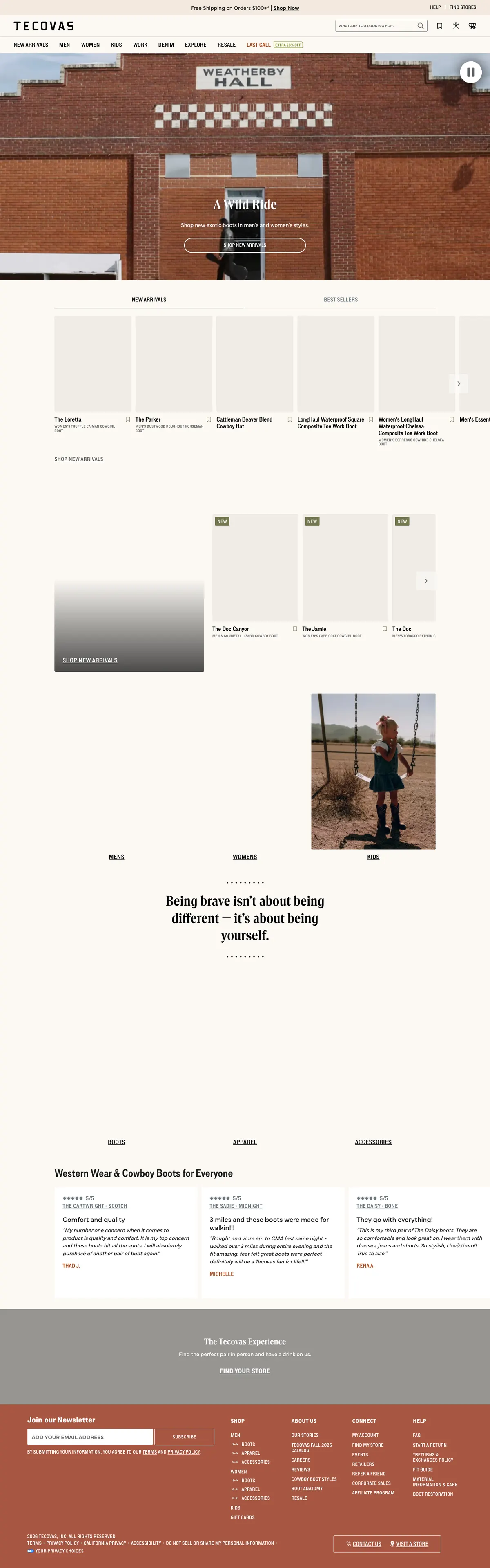
Tecovas homepage, desktop, captured 7 September 2026. Scroll inside the frame. Savannah Sevens
Women's western boutique, the closest peer in size and audience
- Two promises in the top bar: a limited offer and free shipping over $175
- Centred logo like Blush Out West, but with a visible category bar with dropdowns
- Homepage sections for Just hit the floor, featured collections, real customer reviews, a denim guide, the blog and the backstory
- Wishlist, account, search and chat in the header
- A long page at 7,642 px, but it is a sequence of stories, not one grid
Proof that a boutique with a centred logo can still show categories, reviews and a story without losing the look.

Savannah Sevens homepage, desktop, captured 7 September 2026. Scroll inside the frame. Ranch Dress'n
Women's western boutique with a rodeo focus
- Eight categories visible under the logo, with a promo bar beneath
- One sentence under the hero says what the brand is and who it is for
- New arrivals cards carry a size selector and Add to Cart
- Sponsorships and a rodeo identity give the brand a point of view
- Footer with FAQ, shipping and returns, newsletter form and payment icons
A one-line brand statement and quick add on cards are cheap wins for a store of this size.
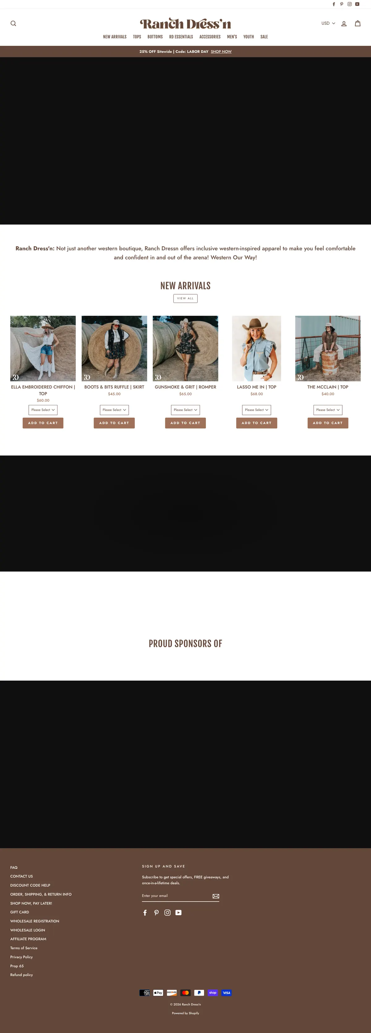
Ranch Dress'n homepage, desktop, captured 7 September 2026. Scroll inside the frame. Cowgirl Kim
Higher-end multi-brand western retailer
- Categories organised by brand as well as type, matching how its customers shop
- Chat widget and social links in the utility bar
- A dated sale banner still showing in September, a reminder to keep promotions time-boxed
- Blog posts featured on the homepage
Brand-led navigation works for a curated shop, and stale promotions cost trust; the announcement bar needs an end date.
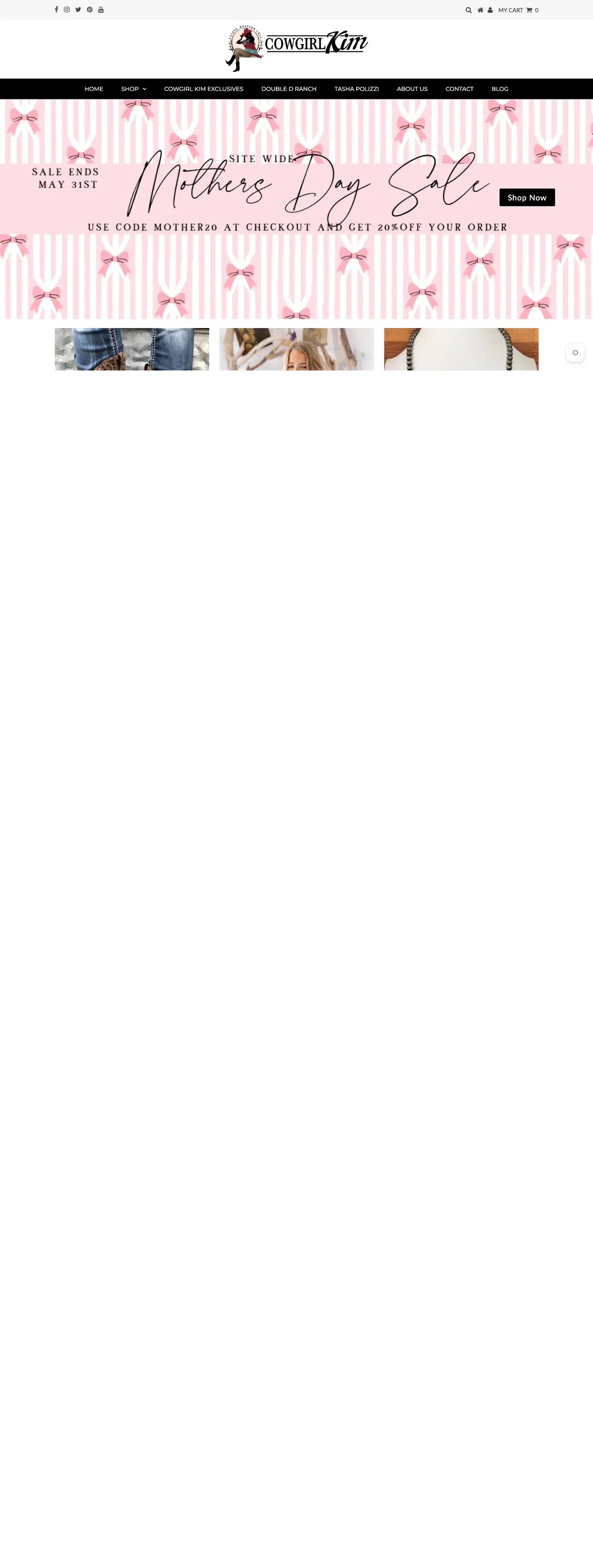
Cowgirl Kim homepage, desktop, captured 7 September 2026. Scroll inside the frame. Wild Junkie
Bold-voice western boutique with a large following
- Also uses a hamburger on desktop, but keeps search, account and cart visible and the header at 100 px
- A ticker promo bar with a giveaway hook
- A social proof bar right under the hero: 4.7 out of 5 from 5,711 reviews
- Best sellers first, with pre-order badges
- A distinct brand voice, Worst behavior, best clothes, carried into the copy
If a hamburger stays on desktop, the header must be short and the social proof loud.
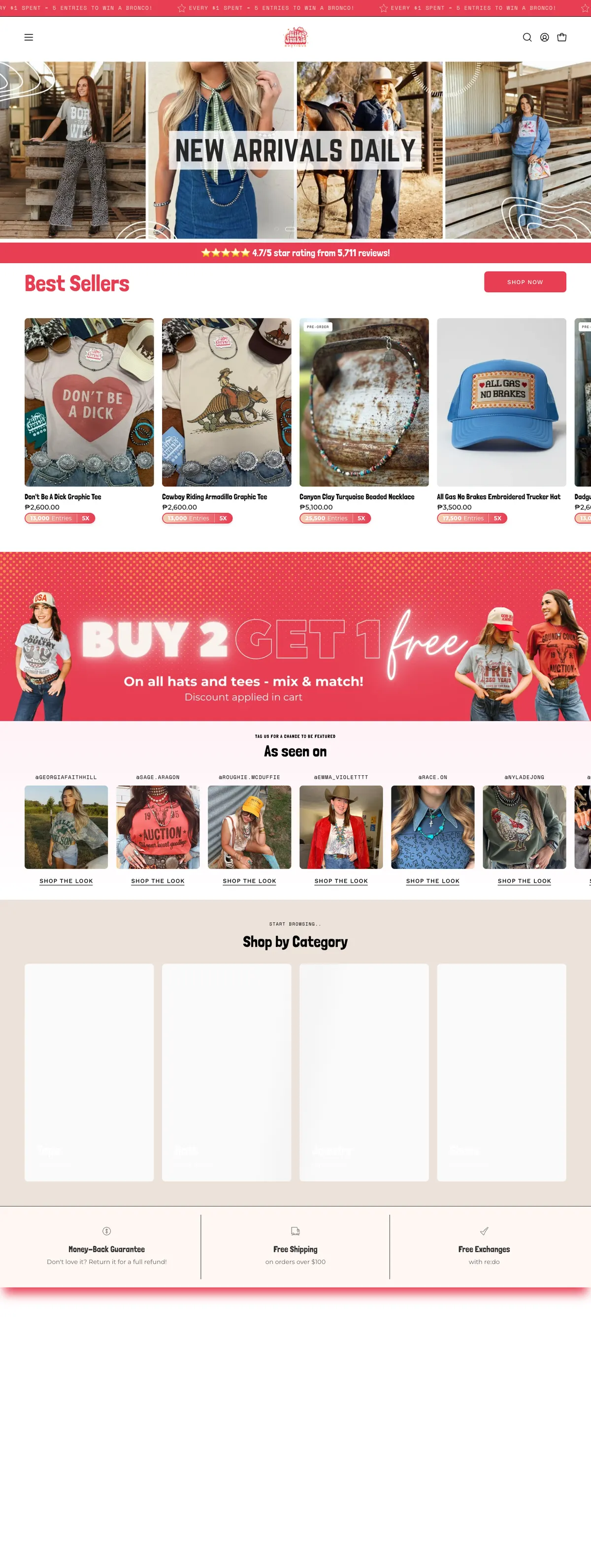
Wild Junkie homepage, desktop, captured 7 September 2026. Scroll inside the frame.
Pain points
Everything above, collapsed into twelve problems ranked by how much they cost. Each one links to the audit finding that documents it.
| Pain point | Who | Where | Severity | Fix |
|---|---|---|---|---|
| Cannot see what the store sells without opening a menu | Everyone | Header | Critical | Visible category bar on desktop, category tiles on the homepage |
| A popup blocks the first view | Kayla, Jess | Homepage | Critical | Delay the offer, keep an inline signup |
| Fifty products in one column with no shortcuts | Kayla | Homepage | Critical | Short homepage with categories and eight new arrivals |
| The buy button is easy to miss and below the fold on phones | Kayla, Jess | Product page | Critical | Solid Add to Cart, sticky bar on mobile |
| Turquoise is promised but nearly absent, with no authenticity details | Deb | Collections, product page | Major | Stock or fold the collection; artisan and stone details per piece |
| Uncertain about size: no guide, unclear sold-out sizes, no reviews | Kayla, Jess | Product page | Major | Size guide, fit notes, Notify me, reviews |
| Return policy found late and felt as a risk | Jess | Contact page | Major | Summary under Add to Cart; owners review the policy |
| No hours, map or photo for the booth | Deb | Homepage, footer, contact | Major | Visit us block reused across the site |
| Code printed in search results and blog excerpts | Jess, Deb | Search, blog | Major | Template fixes, or a theme upgrade |
| Light gold headings and small monospace text are hard to read | Deb | Every page | Major | Darker headings, one sans for prices and buttons, nothing under 14 px |
| Heavy pages on a phone connection | Kayla, Jess | Every page | Major | App audit and an Online Store 2.0 theme |
| The press, awards and owners are buried | Everyone | Homepage | Minor | Press strip and one-line story near the top |
What this means for the redesign
The order of work, from the research.
- Navigation first: a visible category bar and category tiles fix the largest problem for every persona at once.
- A short homepage that tells the story in order: promise, hero, categories, new arrivals, sterling and turquoise, press and reviews, owners, visit us, signup.
- A product page built for confidence: solid Add to Cart, sticky bar on phones, size guide, fit notes, reviews, and a shipping and returns summary.
- Jewelry treated as the hallmark it claims to be, with authenticity details per piece, or held back from the menu until the range is deep enough.
- A footer that answers the last three questions: how do I reach you, where are you, and what happens if it does not fit.
- Theme and app housekeeping so the store loads fast on a rural phone connection and no code prints on the page.