Design audit
32 findings from a walkthrough of the live store on desktop and phone. Each one shows what we saw, what we measured and what to do about it.
| Theme | Brooklyn 17.4.0A retired Shopify theme, no Online Store 2.0 sections |
|---|---|
| Header height on desktop | 245 pxAnnouncement bar plus logo band, on a 900 px tall screen |
| Homepage length | 12,688 px24,655 px on a phone, 50 products in one grid |
| Categories visible without a click | 0All 10 collections sit behind a hamburger, on desktop too |
| Products in the Sterling Silver collection | 1The second item in the menu and the brand's stated hallmark |
| Add to Cart position on a phone | 1,053 pxBelow an 844 px screen, with no sticky bar |
| Heading color contrast | 2.51 : 1Gold headings on the cream background, below the 3 : 1 minimum |
| Requests on a collection page | 14769 scripts and 46 third-party requests |
Severity is about lost sales, not code quality. Critical findings stop a shopper from finding or buying a product. Major findings make the store harder to trust or use. Minor findings are polish.
Header and navigation
The header is the most repeated element on the store, and it currently does the least. It hides the catalogue, takes a quarter of the first screen and carries a broken message.
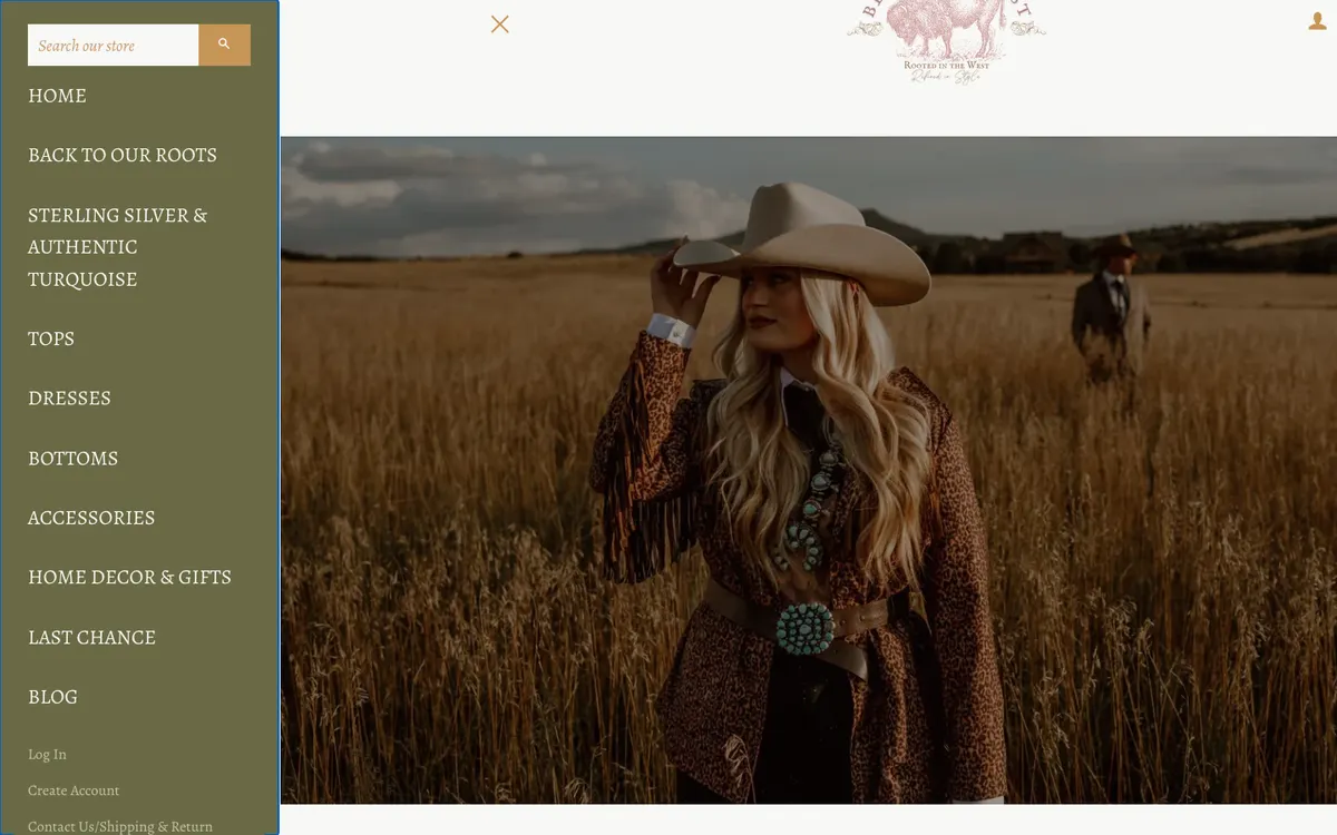
The header takes 245 px before any content appears
MajorEvery page, desktop
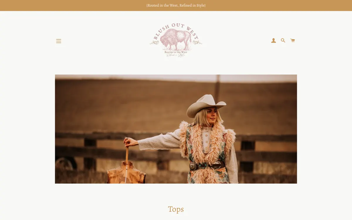
The announcement bar is 45 px and the logo band is 200 px. On a common 1440 by 900 laptop screen the header uses 27 percent of the first view, and the product title on a product page starts 410 px down. The header does not shrink on scroll.
Recommendation. Reduce the logo band to 90 to 110 px, move the bison mark into a compact lockup and make the header stick in a 64 px version once the visitor scrolls.
The announcement bar shows literal curly braces and fails contrast
MajorEvery page
The bar reads {Rooted in the West, Refined in Style} with the braces rendered as text. Its brown text on the tan background measures 1.92 : 1, far below the 4.5 : 1 minimum. The bar also carries no promise a shopper can act on: no shipping threshold, no local pickup, no return window.
Recommendation. Use the bar for one promise per season, for example free shipping over a threshold or in-store pickup in Castle Rock, in a dark text on light colour pair that passes 4.5 : 1.
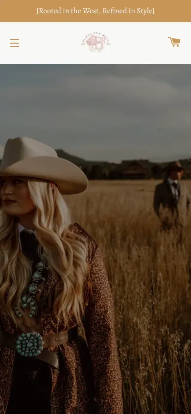
Search and account disappear from the header on phones
MinorEvery page, mobile
On a 390 px wide screen the header keeps only the menu icon, the logo and the cart. Search is reachable only by opening the drawer first. The tap targets that remain are a good size at 50 px.
Recommendation. Keep a search icon in the mobile header and make the header sticky so search and cart are always one tap away.
The drawer lists ten all-caps labels with no grouping and low-contrast secondary links
MajorNavigation drawer, desktop and mobile
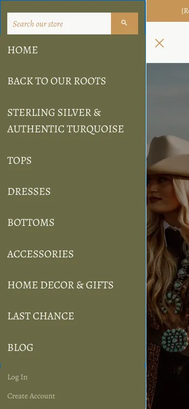
Items are set in 22 px capitals with no imagery, no counts and no grouping, so Sterling Silver & Authentic Turquoise wraps onto three lines. Secondary links such as Log In and Create Account measure 3.11 : 1 against the olive background. Blog sits between shopping links and account links.
Recommendation. Group the drawer into Shop, Our story and Help. Shorten labels (Sterling & Turquoise), add small category images and use sentence case with a text colour that passes 4.5 : 1.
Collection URLs do not match their labels
MinorNavigation links
Dresses links to /collections/dressses (a typo), Accessories links to /collections/fashion-jewelry and Last Chance links to /collections/throw-it-in-for-12. These handles appear in the address bar, in shared links and in search results.
Recommendation. Rename the handles to match the labels and add redirects from the old URLs so existing links and search rankings are kept.
Homepage
The homepage has strong photography and a real story to tell, but it is structured as one long collection page with a popup in front of it.
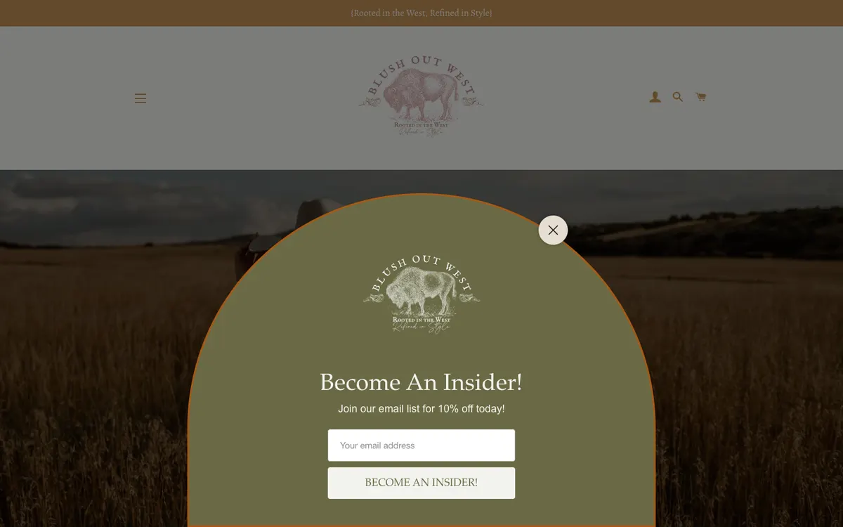
A newsletter popup opens over the hero before the visitor sees anything
CriticalHomepage, first visit, desktop and mobile
The Mailchimp popup appears within two seconds of the page loading and sits over the hero photograph. On a phone it fills the screen. Because it is injected in front of the page, it also blocked the menu button in our tests until it was closed.
Recommendation. Trigger the 10 percent offer after a visitor has scrolled past the first products or after 20 seconds, keep an inline signup near the footer, and never show it twice in one session.
The hero has no headline, no call to action and no link
MajorHomepage
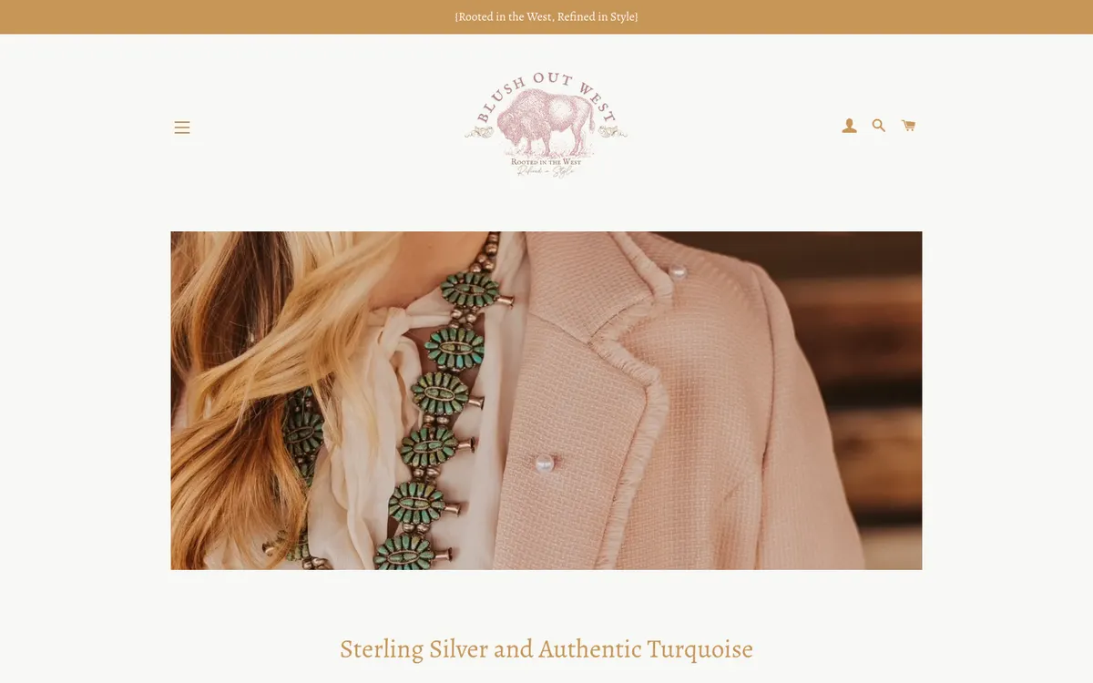
The slideshow shows a single photograph of the owners in a field with no text over it and nothing to click. To a screen reader the slideshow is an empty tab panel. A visitor who arrives from Instagram or a magazine feature gets no confirmation of what the store sells or where to start.
Recommendation. Keep the photograph and add a short headline, one primary action (Shop new arrivals) and one secondary action (Sterling & turquoise).
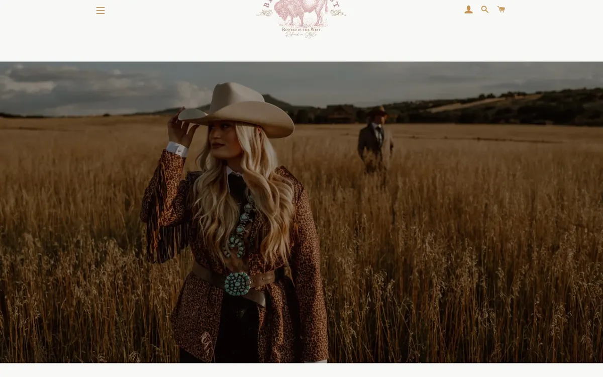
The homepage is one 50-product grid, 12,688 px tall on desktop and 24,655 px on a phone
CriticalHomepage, desktop and mobile
Below the hero, a single section titled Back To Our Roots lists 50 products in a three-column grid. On a phone the grid becomes one column, so each product takes a full screen and the page runs to 24,655 px. There are no category tiles, no new arrivals block and no best sellers, so the page cannot be scanned.
Recommendation. Rebuild the homepage as a short route: hero, six category tiles, eight new arrivals, the sterling and turquoise story, press and reviews, the owners, the Castle Rock booth, then the email signup.

Press, awards and the owners' story are buried at the bottom as plain links
MajorHomepage, below the product grid
Cowgirl Magazine features, the Cowgirl 30 Under 30 listing, a Boutique Hub podcast and Colorado Boutique of the Year 2019 are listed as bold text links under an As Featured In heading, after 50 products. The mother and daughter story is set as a level 6 heading in 17 px monospace. The Emporium booth in Castle Rock is announced under a heart emoji heading with no hours, map or photo.
Recommendation. Move a press logo strip and one line of the story to just below the new arrivals, and give the Castle Rock booth its own block with hours, address, map link and a photo.

Several product cards render without an image
MinorHomepage grid
Three product cards in the grid have no image source at all, and the theme's script-based lazy loading leaves grey placeholders during a fast scroll. In our full-page capture only 38 of 52 images had loaded on desktop.
Recommendation. Give every product a primary image, use native lazy loading with width and height attributes, and hide products that have no image from featured sections.
Sold-out items stay in the homepage grid with a badge that splits into two lines
MinorHomepage grid
The Linen Room Spray is sold out but keeps its position in the grid, and the Sold Out badge is rendered as two separate words on two lines.
Recommendation. Move sold-out items to the end of featured grids or hide them, and style the badge as a single label with a back-in-stock link on the product page.
Typography and color
The palette of cream, tan, brown and olive is warm and appropriate, but the theme mixes three type voices and sets most headings in a gold that is too light to read.
A system monospace font is used for prices, buttons, sizes and body copy
MajorEvery page
The theme's accent font is set to SF Mono, an Apple system font that falls back to a generic monospace on Windows and Android. It is used for the Add to Cart label (13 px), size options (13 px), the address (19 px), the owners' story (17 px) and the We're Open text (11 px with 1 px letter-spacing). Alegreya serif is used everywhere else, so the store speaks in two unrelated voices.
Recommendation. Use two families: the serif for headings and product names, and one legible sans for prices, buttons, forms and small text. Set nothing below 14 px.

Gold headings and icons measure 2.51 : 1 against the cream background
MajorEvery page
Section headings (40 px), product page titles (36 px), the header icons and the address block all use rgb(199, 149, 87) on rgb(248, 248, 245), a 2.51 : 1 ratio. Large text needs 3 : 1 and icons need 3 : 1. Body text in brown measures 4.82 : 1 and passes.
Recommendation. Keep the gold as an accent for rules and small ornaments, and set headings and icons in the darker brown already used for body text, or in a brown of at least rgb(140, 90, 18) which measures over 4.5 : 1.
Heading levels are used for styling rather than structure
MinorHomepage
The only level 1 heading is the logo. The street address is a level 5 heading, the owners' paragraph is a level 6 heading, and the We're Open and The Emporium headings are both level 2. Screen reader users and search engines get a confusing outline.
Recommendation. Give each page one visible level 1 heading, use levels 2 and 3 for sections and cards, and style the address and story as paragraphs.
Collection pages
Collection pages repeat the homepage problem in miniature: a large image first, products later, and few tools for narrowing down.
Products start below the first screen on collection pages
MajorCollection pages, desktop
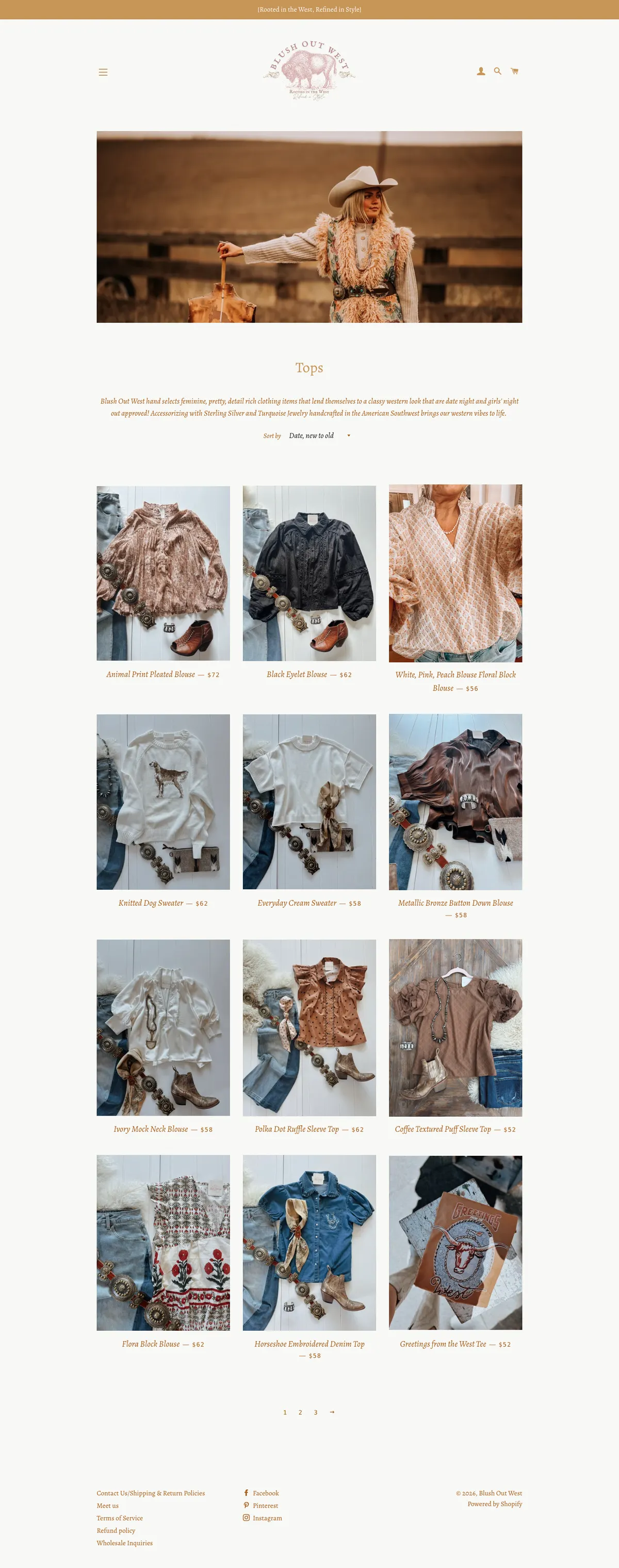
After the 245 px header comes a full-width banner photograph, then the title Tops at about 850 px. The first row of products appears only after scrolling. On a phone the banner and title fill the first screen as well.
Recommendation. Replace the banner with a compact collection header: title, product count, one line of description and the filters, so the first products are visible without scrolling.
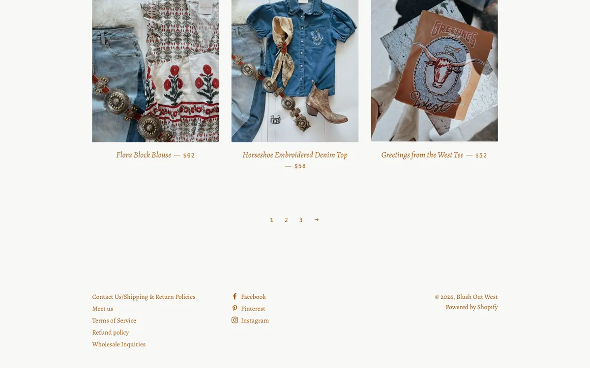
Twelve products per page, numbered pagination and no size or price filters
MajorCollection pages
All Products runs to eleven pages of twelve. Brooklyn offers a sort dropdown and a tag list but no filtering by size, colour or price, and there are no breadcrumbs to step back to a parent collection.
Recommendation. Show 24 to 36 products per page with a Load more control, add size, colour and price filters that use Shopify's native filter data, and add breadcrumbs.
The Sterling Silver & Authentic Turquoise collection holds one product
MajorCollections, navigation
This collection is the second item in the menu and is called out in the store's meta description as a reason to shop here. It contains a single product, and its All Sales Final policy is stated only in the collection description, not on the product page.
Recommendation. Either stock the collection before the relaunch or fold jewelry into Accessories until it is deep enough for its own menu item. Put the final-sale notice and the artisan and stone details on each jewelry product page.
Several menu collections are small and overlap
MinorCollections
Dresses & Rompers has six products and Last Chance has seven. Back To Our Roots is a curated set that duplicates items from Tops and Bottoms. Ten menu items for roughly 130 products spreads the catalogue thin.
Recommendation. Reduce the menu to New arrivals, Tops, Bottoms, Dresses, Jewelry and accessories, Home and gifts, and Sale. Use curated sets as homepage stories rather than menu items.
Product page
The product page has good styled photography and Afterpay messaging, but the buy action is easy to miss and the information a shopper needs before committing is missing.
Add to Cart is an outlined button beside a solid purple Buy with Shop button
CriticalProduct page, desktop and mobile
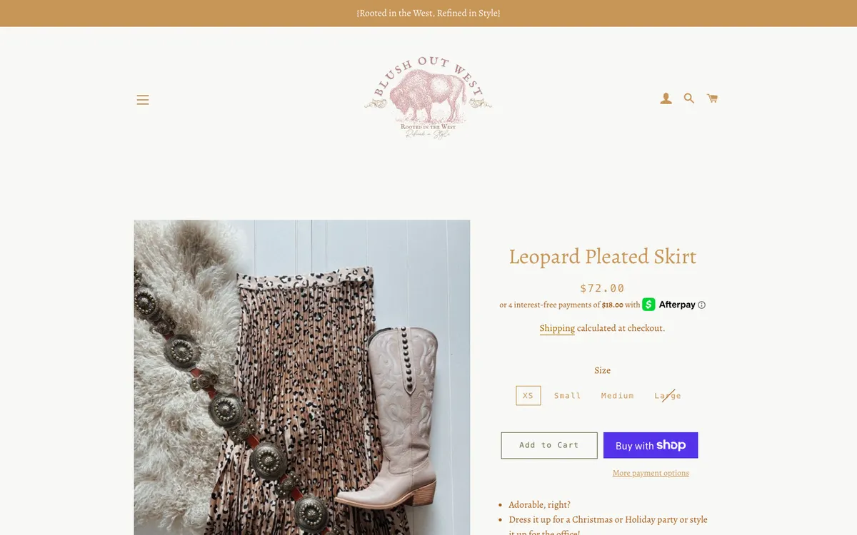
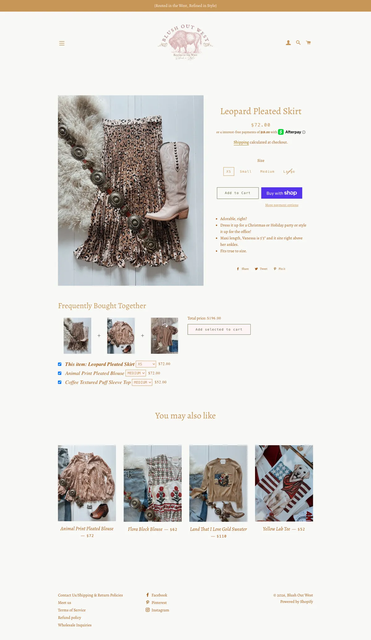
The store's own action is a 162 by 44 px outline button with a 13 px monospace label. Next to it, Shopify's dynamic checkout button is solid purple and draws the eye first. On a phone Add to Cart sits 1,053 px down an 844 px screen, and there is no sticky bar, so a shopper must scroll to buy.
Recommendation. Make Add to Cart a full-width solid button in the brand's dark brown, move the Shop Pay button below it in a quieter style, and add a sticky bar on phones with the price, size and Add to Cart.
Sold-out sizes are marked only by a thin diagonal line, and there is no size guide
MajorProduct page
The Large size on the Leopard Pleated Skirt is unavailable and is shown with a single strike line through the label. There is no size guide, no back-in-stock request and the only fit reference is a sentence in the description saying the model is five foot five.
Recommendation. Show unavailable sizes in a clearly disabled style with a Notify me link, add a size guide with body measurements per size, and add a fit note field (true to size, runs small) to every product.
Descriptions are short and informal, with no fabric, care or fit details
MajorProduct page
The Leopard Pleated Skirt description is 176 characters and opens with Adorable, right? There is no fabric composition, no care instruction, no measurement table and no note about what it was styled with in the photo, although the photos feature belts and boots the store also sells.
Recommendation. Use a structured product template with four blocks: description, fit and sizing, fabric and care, shipping and returns. Link the accessories shown in each photo as Shop the look.
No reviews, and the return policy is only on the Contact page
MajorProduct page
There is no review widget anywhere on the store. Shipping is described only as calculated at checkout. The return policy, which is store credit only within 14 days with the buyer paying return postage and a possible 20 percent restocking fee, is written on the Contact Us page and never near the buy button.
Recommendation. Add a reviews app and request reviews after delivery. Put a two-line shipping and returns summary under Add to Cart, and consider whether the policy itself is holding back first-time buyers.
The price block reads Regular price Sale price $72.00 Unit price per to assistive technology
MinorProduct page
Hidden labels for compare-at and unit pricing are present in the price block even when there is no sale and no unit price, so a screen reader announces all of them.
Recommendation. Render only the labels that apply to the product, and mark the price with a visible currency and cents consistently across the grid and the product page.
Search, blog and cart
Two template bugs print code on the page, and the cart does nothing to help a shopper continue.
Search results print raw CSS on the page
MajorSearch results
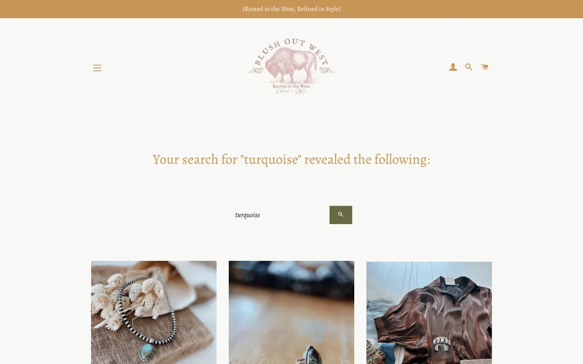
Searching for turquoise returns 20 products, but the results list also outputs style code as visible text, starting with @media screen and (min-width: 591px). The result heading reads Your search for turquoise revealed the following, which is unusual phrasing for a store.
Recommendation. Fix the search result template so inline styles are not printed, show a result count, and add filters for products, articles and pages.
The blog list prints image HTML as text in each excerpt
MajorBlog listing
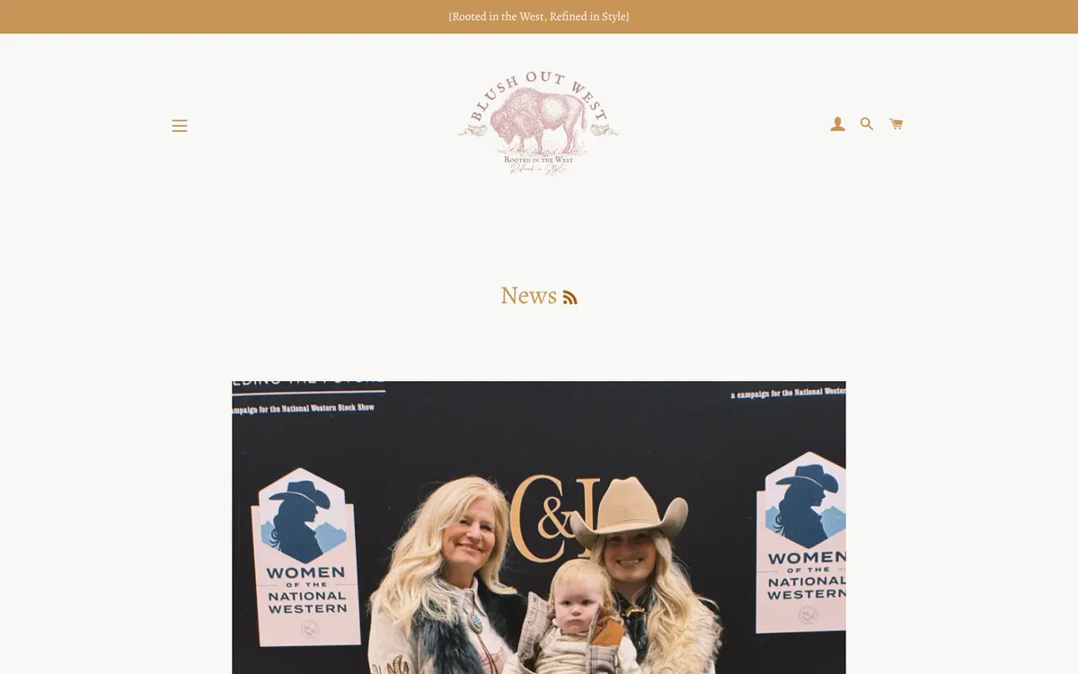
Each article excerpt begins with an escaped image tag, so visitors see code before the summary. The blog holds 26 posts and covers the stock show circuit and fashion shows, which is strong content, but the cadence gaps from October 2023 to July 2025.
Recommendation. Fix the excerpt filter, rename the blog from News to something like Events and Style, and feature the latest post on the homepage.
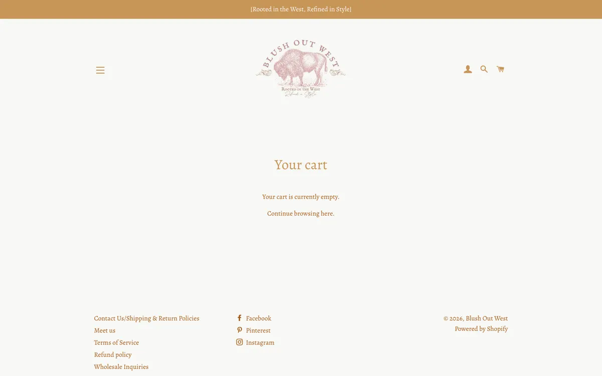
The empty cart is a single sentence with nowhere to go
MinorCart page
The cart page reads Your cart is currently empty. Continue browsing here. Adding an item sends the shopper to this full page rather than opening a drawer, and there is no shipping threshold progress or recommendation on it.
Recommendation. Use a cart drawer that opens on add, shows a shipping threshold bar and two recommended items, and links back to New arrivals when empty.
Footer and store information
The footer is where shoppers look for reassurance and directions. Today it has five links.
The footer has five links, three social icons and nothing else
MajorEvery page
There is no newsletter signup, no phone number, no email, no address, no hours and no payment icons in the footer, although the phone number 720-301-9308 and the email address exist on the Contact page. The social icons render as icon-font glyphs with a stray letter for the fallback text.
Recommendation. Build a four-column footer: Shop, Help (shipping, returns, size guide, contact), Visit us (booth address, hours, map link) and Stay in touch (email signup, social, payment icons).
The store location story is split across three pages and never reconciled
MinorHomepage, About page, Contact page
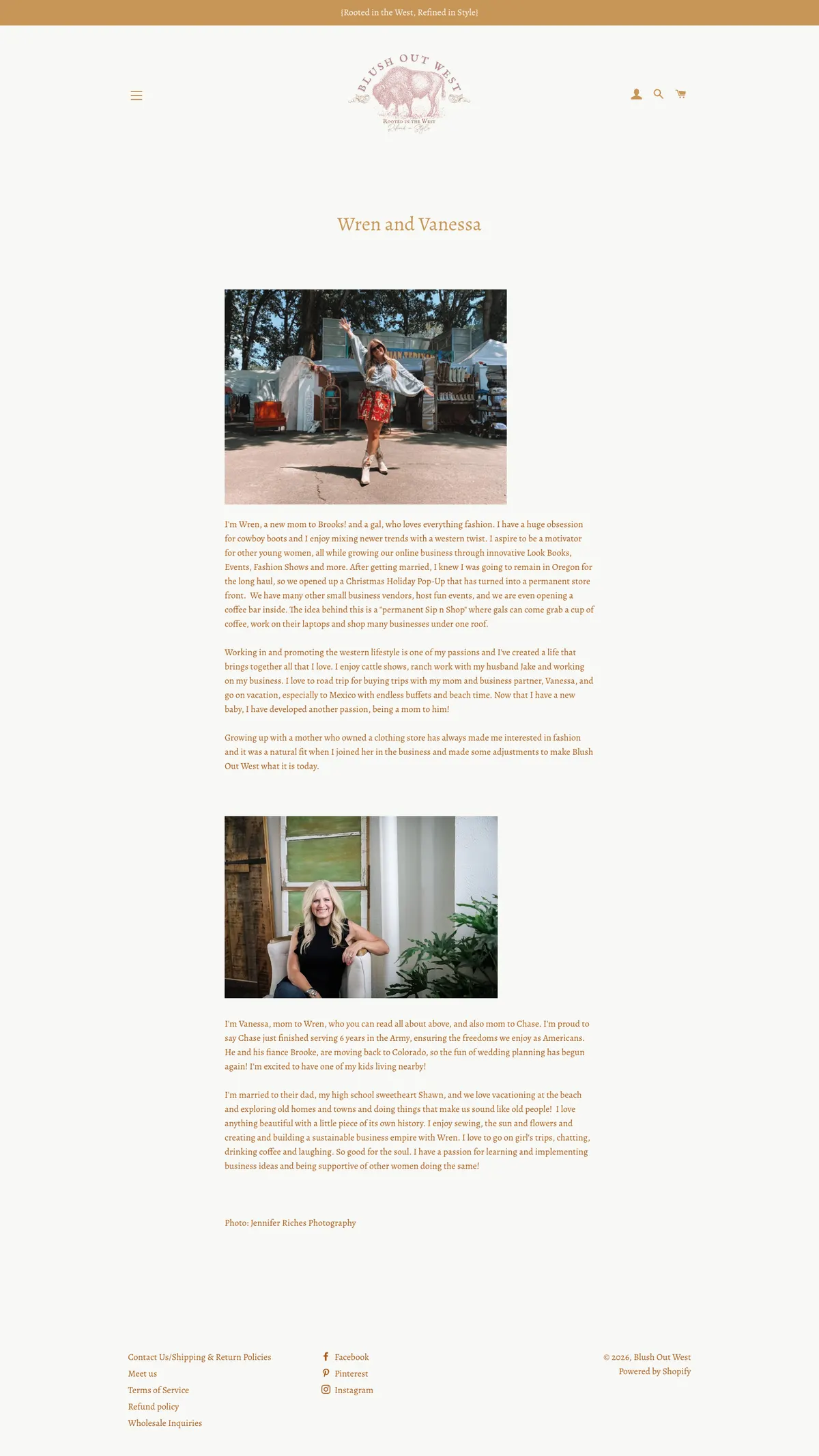
The homepage announces The Emporium booth at 200 Perry St., Castle Rock, Colorado. The Meet Us page describes a permanent storefront in Oregon opened after a holiday pop-up. The Contact page lists a phone and email but no address at all.
Recommendation. Write one Visit us block with each location, its hours and what a visitor will find there, and reuse it on the homepage, the About page and the footer.
Performance and accessibility
The theme is old, the app stack is heavy, and a few technical details undermine the polish of the photography.
A collection page makes 147 requests, 69 of them scripts and 46 to third parties
MajorEvery page
The homepage document loads 77 scripts and 60 stylesheets. Third-party requests include the Mailchimp popup, an Intuit pixel, Afterpay and Shop. In our test on a fast connection the load event fired at about one second, so on a rural mobile connection the delay will be several times longer.
Recommendation. Audit installed apps and remove the ones no longer used, move to an Online Store 2.0 theme with native lazy loading and sections everywhere, and load the email popup script only when it is due to show.
Icon-font fallback text leaks a stray letter at the top and bottom of every page
MajorEvery page
The theme's icon font marks each icon with a fallback character. A lone s appears as the first and last text node of the page, and screen readers announce it. The social icons in the footer expose the same glyphs.
Recommendation. Replace the icon font with inline SVG icons that carry an accessible label, which is standard in current Shopify themes.
The hero slideshow is an empty tab panel with no controls
MinorHomepage
The slideshow region contains a tab panel with no accessible content and no visible previous, next or pause control, so keyboard and screen reader users cannot tell there is a hero at all.
Recommendation. Use a single static hero image with text, or a slideshow with visible controls, alt text per slide and a pause button.