Redesign
A working homepage concept for Blush Out West. It tells the store's own story in four chapters, from the buying trip through the Southwest to the booth in Castle Rock, and puts the catalogue in reach from the first screen.
The concept is a real page, not a picture. It scrolls, the scenes pin, the product rail moves, and the newsletter form responds. It uses the store's own photography and prices.
Open the homepage concept| Header height | 108 px245 px on the live store, on the same 1440 by 900 screen |
|---|---|
| Categories reachable without a click | 179 in the header, 8 in the chip strip under the hero. None today |
| Products on the homepage | 8A curated rail rather than the current 50-product grid |
| Lowest text contrast | 4.52 : 1Every text pair passes the 4.5 : 1 minimum. The live store's headings sit at 2.51 : 1 |
| Type families | 3Italiana for display, Jost for interface, Cormorant Garamond for the story voice |
| Lazy-loaded images | 36 of 38The hero and its scrim load first. The live store lazy-loads none |
The homepage, scene by scene
The page is one story in four chapters. Each scene below shows what a visitor sees and what it answers from the audit.
A hero that says what this is
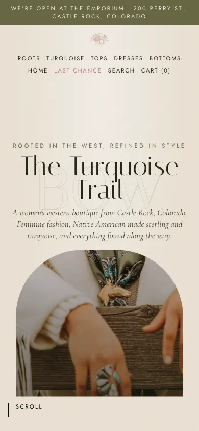
The store's name, a headline and one sentence of positioning sit above an arch of the brand's own photography that opens as the visitor scrolls. Beneath it, a chip strip lists every collection, so the catalogue is one click away before anything else happens.
Answers the empty hero, the hidden catalogue and the 245 px header.
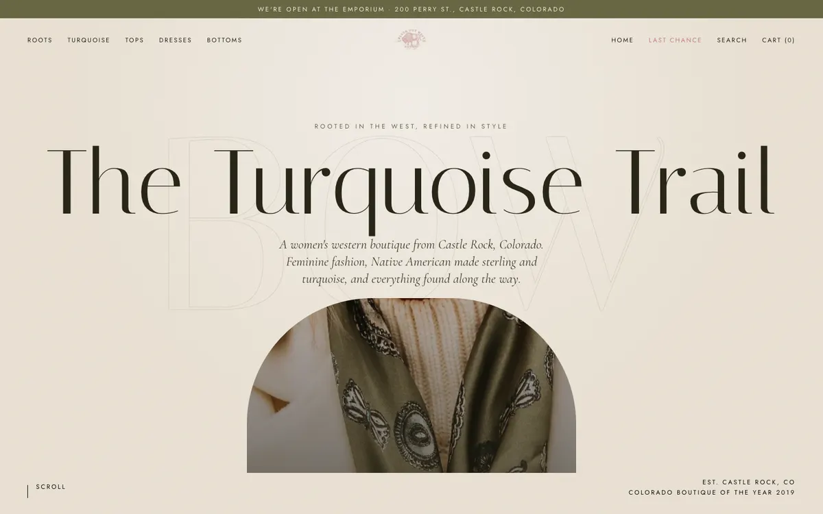
The arch opens as you scroll
The masked photograph widens to full bleed while the headline lifts away, and a line of the story appears over it. One orchestrated moment at the top of the page rather than an effect on every section.
Replaces the static slideshow that had no text, no controls and nothing to click.
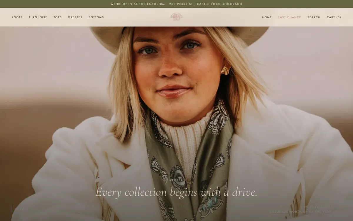
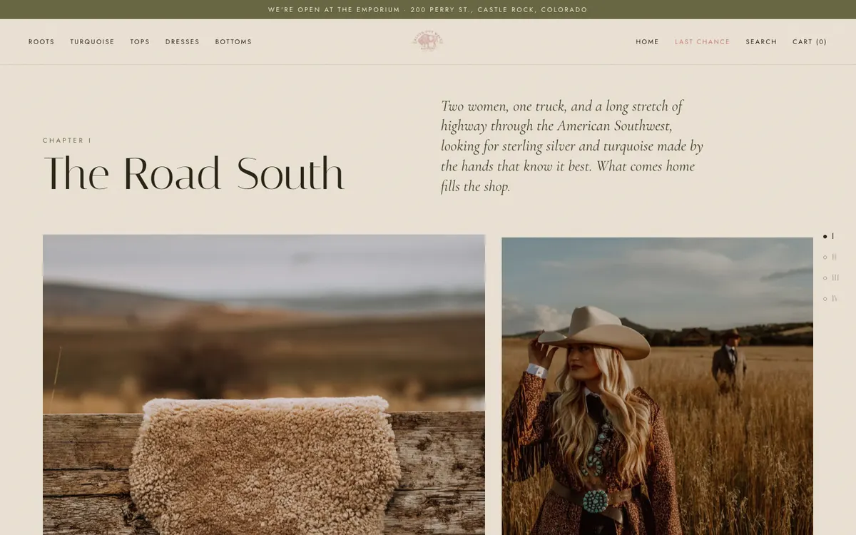
Chapter I
The Road South
The buying trip, told with the owners' own photographs and a three-stop itinerary from Los Angeles to the Southwest to Castle Rock. This is the part of the brand that no competitor can copy, so it comes early rather than sitting under fifty products.
Moves the story out of the bottom of the page.
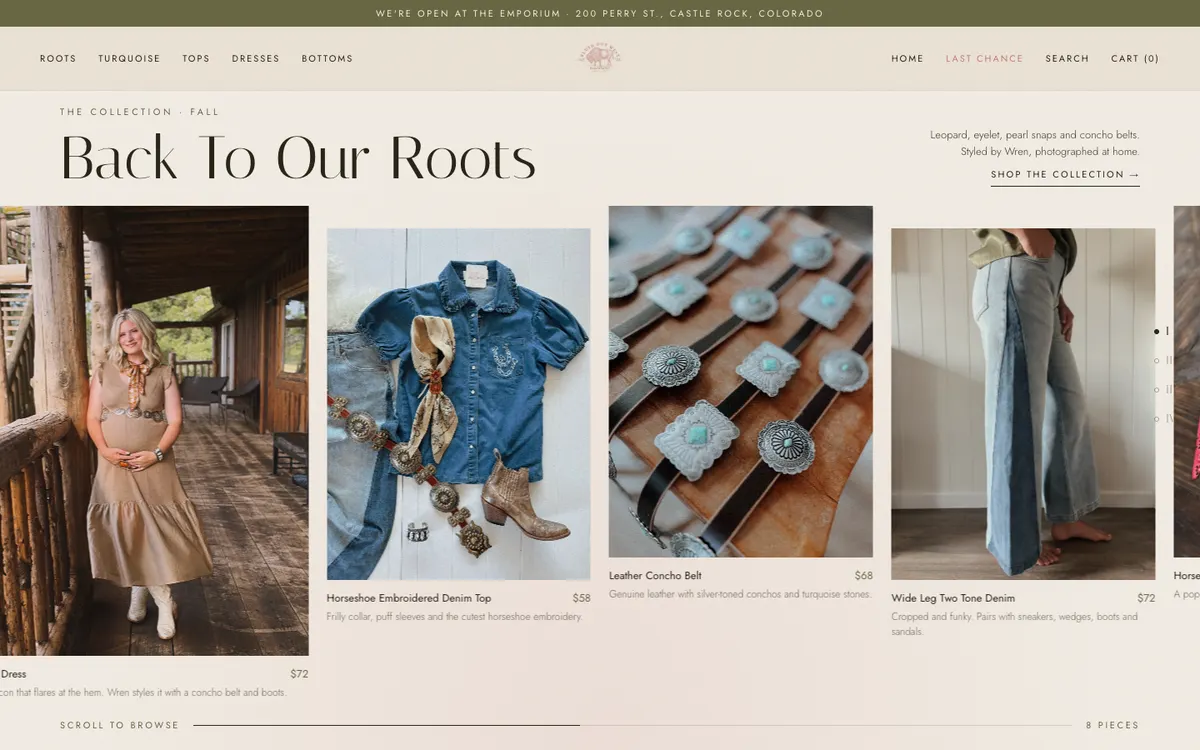
Eight pieces, not fifty
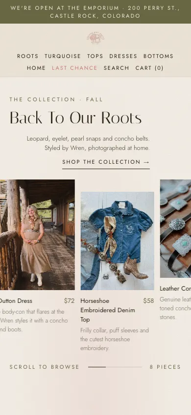
The Back To Our Roots collection becomes a horizontal rail that moves as the visitor scrolls down. Each card carries the price, the size range and a line in Wren's voice. A progress line shows how far through the eight pieces they are, and the last card opens the full collection.
Replaces the 50-product grid, and puts size and fit information on the card.
Chapter II
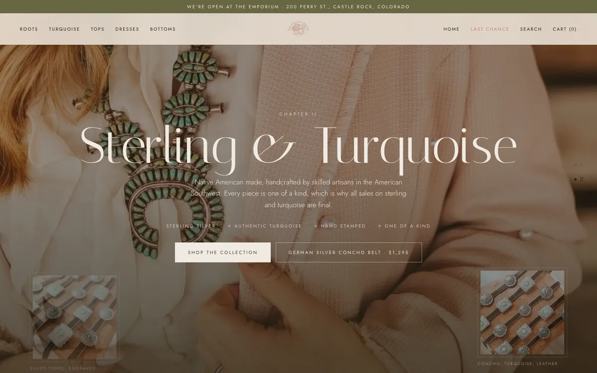
Sterling & Turquoise
The jewelry gets a full screen: a circular reveal of the collection photograph, the four things that make it worth the price, and the final-sale policy stated in the open rather than buried in a collection description. Two product insets sit in the corners.
Gives the hallmark collection the weight the store's own meta description claims for it.
Chapter III
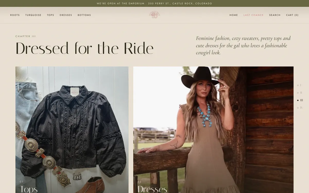
Dressed for the Ride
Five category tiles in a broken grid: tops, dresses, bottoms, accessories, and a looping video of the wild rag. Each tile reveals a line about what is inside it on hover, and shows that line outright on touch devices.
This is the category navigation the homepage never had.
Chapter IV
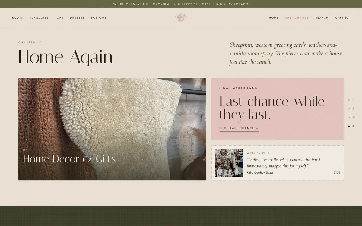
Home Again
Home decor and gifts, the sale tile, and one staff pick with a quote from Wren. The sale is a destination rather than a menu item in a different colour.
Gives Last Chance and the gift range somewhere to live on the homepage.
Wren and Vanessa, in the middle of the page
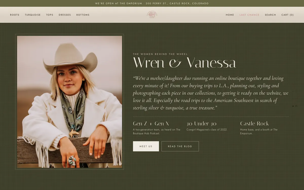
The mother and daughter story, the press they have earned, and the two-generation team, all above the fold of their own section rather than set as a level 6 heading at the bottom. A press marquee and a four-point promise strip carry the rest of the proof.
Moves the press, the awards and the owners into the path a shopper actually takes.
The same story on a phone
Every scene reflows to one column. The arch opens up so it is not a sliver, the rail becomes a swipeable row, and the category notes that appear on hover are shown outright because a phone has no hover.
The current homepage runs to 24,655 px in a single column on a phone.
The rail on a phone
The horizontal rail keeps working at phone width, showing two and a half cards with their prices and fit notes, and the same progress line underneath.
Type and colour
The palette keeps the cream, brown and olive the brand already owns, and fixes the contrast. Rose is reserved for sale, so a discount reads at a glance.
- Sand#EFE6D8The page
- Cream#F7F1E8Raised panels and strips
- Ink#2A2718Text and the footer
- Pine#3F3F2ADark scenes and the story voice
- Olive#6A6A45Labels, prices, the announcement bar
- Blush#E9C9C4The newsletter and accents on dark
- Rose#C97F7FSale only
- ItalianaHeadlines and chapter titlesA high-contrast serif that carries the boutique feel at large sizes.
- JostNavigation, prices, buttons, formsReplaces the system monospace the current theme uses for prices and buttons.
- Cormorant Garamond italicThe story voiceUsed only where the brand is speaking: ledes, quotes and captions.
What the concept answers
Twelve of the audit findings are addressed by the homepage alone. Each row links to the finding it came from.
| Finding | In the concept |
|---|---|
| The whole catalogue is hidden behind a hamburger | Nine category links in the header and eight chips under the hero |
| The homepage is one 50-product grid | Four chapters, eight curated products, five category tiles |
| A newsletter popup opens over the hero | No popup. The signup is a section at the end of the story |
| The hero has no headline, no call to action and no link | A headline, a line of positioning, and the chip strip below it |
| The header takes 245 px before any content | A 108 px header that stays put and takes on a background as you scroll |
| Gold headings measure 2.51 : 1 | Ink on sand at 12.11 : 1. The lowest pair on the page is 4.52 : 1 |
| A system monospace is used for prices and buttons | Jost for anything a shopper acts on, the serif kept for display |
| The turquoise collection holds one product | A full scene for the collection, with the artisan story and the final-sale terms |
| Press, awards and the owners are buried | A promise strip, a press marquee and an owners' section in the middle of the page |
| The footer has five links and nothing else | Four columns: shop, about, follow, and where to visit |
| The booth location is split across three pages | The Emporium gets its own band with the address and directions, repeated in the footer |
| The announcement bar shows curly braces and fails contrast | The bar carries the booth address at 4.97 : 1 |
Trade-offs and what this concept is not
The honest limits of what you are looking at.
- The concept is longer in scroll distance than today's homepage, not shorter. Three scenes are pinned, so scrolling moves through them rather than past them. The gain is that a shopper reaches a category from the first screen instead of scrolling a grid to find one.
- It uses the store's live photography and prices, hotlinked from Shopify. A real build would pull the same content through theme sections so Vanessa and Wren can reorder the chapters and swap the collection without a developer.
- The pinned scenes and the product rail need a modern theme. This is a further argument for leaving Brooklyn 17.4.0 behind rather than patching it.
- Nothing here changes the returns policy. That is a business decision, and the audit flags it as the thing most likely to lose a first-time out-of-state customer.
Still to come
The homepage is the first of four screens this proposal covers.